Artistic question

Page may contain affiliate links. Please see terms for details.

Spiderweb

Not So Special One
Location
North Yorkshire
Andy,

I do a bit of drawing and painting of boats. They can be difficult!! So keep at it.

I tend to not worry so much about perspective when I do impressionist type of stuff, more formal stuff maybe.

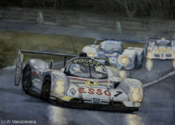
See the following two pictures of mine regarding regarding the horizon position View attachment 430014 View attachment 430015 .
Wow!
I love those @Salar
Wish I had you artistic flair, what a gift you have.
 
Last edited:

Spiderweb

Not So Special One
Location
North Yorkshire
So I need to make a second painting for the dining room to be a partner to this one I painted a few years ago.

The new painting has been giving me some trouble though.

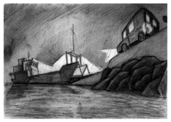
I wanted a small ferry with a post bus approaching it, if possible in (semi) darkness giving the feel of the ferry being a safe haven. I made a few thumbnails:

View attachment 429989

Then came up with a design I liked:

View attachment 429990

The problem with this is
1: possibly too much foreground
2: Bus on wrong side of road with no barrier. If I add a barrier the bus will be hidden.
3: Bus has come over all Postman Pat but that's no big issue.

So, I made another sketch and mucked about a bit on Gimp to make it more what I wanted Atmosphere like this:

View attachment 429991


As for perspective, I don't know; but the middle one seems best:
View attachment 429992
The bus looks a lot better, but they all have a flat quayside which logically would be flooded if the ferry is that high. So I tried to combine the good bits in the first attempt at painting:

View attachment 429987

Hmm... still crummy perspective. There the matter has reated for some time with the picture bugging me constantly.

I wondered if making a more obvious quayside ramp would help:

View attachment 429988


Still not sure though.

I really want to get this moving next week so if anyone has any ideas I'm open to hear them...
The black and white ones look great.
 

twentysix by twentyfive

Clinging on tightly
Location
Over the Hill
I'm no artist but I like this one

darkness_021-png.png
 

Mrs M

Guru
Location
Aberdeenshire
Like the prep sketches :smile:
Just a though :dry:
Wee postman approaching the boat, headlights from the van shining on him to guide his way and link the van and boat together.
If the ferry is the safe haven I would possibly make this the main focus of the painting, waiting for the vulnerable wee postie to find safety guided along by his trusty van.
:ohmy:
 
What medium are you using, @Andy in Germany ? Acrylics?

For my tastes, the colours in the trial painting are too intense. I think that's also part of the problem - the red "pops" out and draws your eye away from the boat. Plus i'm really not a fan of prussian blue.

I'd try and go for a much more subdued palette, which will emphasise the gloom and the wet. A bit like this...

IMG_5079_small2.jpg
 
Yikes I get up and there's half a dozen ideas. Many thanks...

What about composing the picture so that the view is from the ferry welcoming the approaching postvan.

Thanks Andy,

I also started off on the drawing board as a young draughtsman and technical drawing training can hamper you a bit.

The lightship is about as formal as I go in watercolours, I prefer drawing with dip pens, bits of rag, cocktail sticks, that type of thing.

Enough of my stuff.

As the ferry is more interesting than a post van, why not reverse the picture.

Draw it as if you are standing on the ferry deck about a third of the way down with the post van coming towards you in dusk if you want atmosphere.
You can then add boat fittings, the deck construction, lights etc, the ferry will be dominant and take up most of the picture , but you should still be able to tell a story.

The more I thought about this, the less convinced I was that I could achieve it, but I think I've found a compromise that I could get to work. from the beautiful "Life at the End of the Road" blog.If I move the perspective so I'm looking directly onto the deck of the ferry, but still from the shore, as seen in this picture, but obviously with a post van instead of a stone truck...
 
What medium are you using, @Andy in Germany ? Acrylics?

For my tastes, the colours in the trial painting are too intense. I think that's also part of the problem - the red "pops" out and draws your eye away from the boat. Plus i'm really not a fan of prussian blue.

I'd try and go for a much more subdued palette, which will emphasise the gloom and the wet. A bit like this...

View attachment 430053

Yes, I'm using acrylics. I'm entirely with you on the colours: the picture in your post is much more the style I'm aiming for. I just wanted to try the pwerspectives and see how they worked on canvas.

I'd like to change the perspective as described above, and aim for an atmosphere as shown in this image. That way I can worry less about perspective and focus on what I want to learn. And with a straight on drawing, even a Draughtsman trained artist like me can't muck it up.

I'm not so sure I can do the colours though, so any suggestions are welcome.

I'm also supposed to be drawing/painting an Austerity tank locomotive for someone by Christmas...

The painting I posted is watercolour, but the colour palette is one I also use in acrylics. The cool neutral tones are mixed mainly from a combination of burnt umber, ultramarine and payne's grey (and either white or titanium buff when using acrylics). Three colours I don't use at all are black, prussian blue and viridian.

One way you could tackle this is do the underpainting in monochrome (white and payne's grey) and then lay thin watery glazes over to top to apply the colour. Last step would be adding any bright highlights that just need a bit more "pop".
 
Yikes I get up and there's half a dozen ideas. Many thanks...

The more I thought about this, the less convinced I was that I could achieve it, but I think I've found a compromise that I could get to work. from the beautiful "Life at the End of the Road" blog.If I move the perspective so I'm looking directly onto the deck of the ferry, but still from the shore, as seen in this picture, but obviously with a post van instead of a stone truck...

Biscuits. I forgot to link to the the photo I was talking about there...
 
Top Bottom