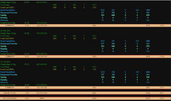
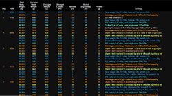
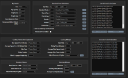
An exercise and weight gain/loss calculator, calculates in 15 minute increments

Page may contain affiliate links. Please see terms for details.
Good evening,


I have just put up an exercise and weight gain/loss calculator. It is different from most in that it calculates digestion, exercise and body weight every 15 minutes for up to 5 days.

At first glance this sounds way over the top, but it is aimed at the

“Will I lose weight if I cycle 10 miles?”

“What happens if I have two Mars bars a day?“

Type of questions.

It is at http://iansmithcse.co.uk/WLC/ExCalc.aspx and as there is so much information on the screen it really needs to be viewed on a tablet, laptop or desktop rather than a mobile phone.

I originally started it for another reason and then thought why not finish it?


As you might guess simulating digestion and exercise at this level requires many assumptions and simplifications but most should look reasonable.

The biggest areas that the simplification may be too simple are

Blood sugar and glycogen are used interchangeably, although modelling them separately is not a problem doing so makes displaying the results harder for very little benefit. Also glycogen’s bound water is lost immediately that the glycogen is used.

Ketosis is not supported, I do plan to add this.

My alcohol processing is way different from “multiply grams of alcohol by 7 to get kilo calories” that is popular. ;-)

There is no recovery period after exercise, I do plan to add this along with more food items.

Anyway thoughts, insults, mockery and suggestions both useful and otherwise are welcomed.


Bye

Ian
 
Last edited:

slowmotion

Quite dreadful
Location
lost somewhere
If you take a piss, you'll lose half a kilo if you had a full bladder.:okay:

https://www.webmd.com/urinary-incontinence-oab/picture-of-the-bladder

The equivalent figure for emptying your bowels is, surprisingly, only about a quarter of that.
 
Last edited:
Morning,

For many things when you know the answer it is obvious. :-)

When I read https://www.cyclechat.net/threads/a-question-about-how-many-calories-are-burned.264908/ I thought wouldn't it be nice to have a worked example rather than just text answers?

There is an example button on the calculator that sets up a 5 day commute and eat plan, this results in glycogen depletion at a couple of points in day 4 which is partially recovered from and day 5's morning ride is where the imaginary person bonks.

My thoughts were that this is much more explanatory than saying "You need to eat enough". :-)

Bye

Ian
 
Last edited:
Good morning,

My web log tells me that some people are playing with/using it so I have updated it on 16 Feb 2021 and added in Ketosis and EPOC

574314
574312
574315

Bye

Ian
 
Last edited:

glasgowcyclist

Charming but somewhat feckless
Location
Scotland
I’d like to give it a try but I can’t read the drop down texts. Grey font on a grey/silver background doesn’t work, could you change to contrasting colours?
 
Good afternoon,
I’d like to give it a try but I can’t read the drop down texts. Grey font on a grey/silver background doesn’t work, could you change to contrasting colours?
Are you using a desktop or mobile?

Are you seeing the colours in the screen shots above and are having trouble with those or are you using an mobile possibly an iPhone, they tend to be the worst for making up the colours that they want to use? :-)

In truth it generally doesn't work well on small screens because it collects and displays so much information.

Thanks

Ian
 

glasgowcyclist

Charming but somewhat feckless
Location
Scotland
Good afternoon,

Are you using a desktop or mobile?

Are you seeing the colours in the screen shots above and are having trouble with those or are you using an mobile possibly an iPhone, they tend to be the worst for making up the colours that they want to use? :-)

In truth it generally doesn't work well on small screens because it collects and displays so much information.

Thanks

Ian

I’m using an iPad. Here’s a screenshot of what I see...

8035B077-465A-4D8C-A91B-1A53885F6058.jpeg


If I click on a drop down, I can see the choices clearly (black on white) but once my selection is made, I have real difficulty reading it.
 
Good afternoon

Thanks for this,

I have had a look and it turns out that I have done something that is not compatible with iPhones and iPads and is not a 5 minute fix.

I will have to look at it as there quite a few iPads out there, but it can't be this afternoon, sorry. :smile:

Thanks

Ian
 

glasgowcyclist

Charming but somewhat feckless
Location
Scotland
Good afternoon

Thanks for this,

I have had a look and it turns out that I have done something that is not compatible with iPhones and iPads and is not a 5 minute fix.

I will have to look at it as there quite a few iPads out there, but it can't be this afternoon, sorry. :smile:

Thanks

Ian

Thanks and good luck. 👍
 
Good morning,

Thanks for the thoughts. :-)

The real problem I have is with screen size, the Mobile First philosophy is to "make the best of limited screen size" and it doesn't really address the issue of what do you do when the screen is simply too small?

Some times you can lose some information and substitute height for width, but sometimes you can't. If I can't have enough space to display 500 lines of 12 columns that the idea behind the calculator doesn't really make much sense. :-) Clearly I could lay out the screen to be 6,000 lines of just 2 columns but that is also pretty unusable.

The point of this calculator is to get away from simplifications, "chocolate bar bad, 10 mile run good" by showing why.

Many people have never heard of say glycogen or have a good feel for it, hence the success of classes in "the fat burning zone". By tracking the glycogen change over the digestion period of that chocolate bar along with the glycogen usage during a slow bike ride you can look at numbers and decide "run bad, chocolate good, fat burning zone waste of time/great for me".

The cost of this approach is a requirement for a large screen.

So I made the decision that as there simply isn't enough space on a mobile phone screen I wouldn't support overly small screens, instead I would explain that without a larger screen the whole thing is pointless. What I forgot is that the iPad Safari browser is the same as the iPhone Safari browser not the desktop Safari browser. The big difference is that mobile Safari doesn't accept styling on combo boxes, hence the grey on silver.

As there are a lot of iPads and the screen is big enough to be useful initially I need to make some changes, but even with tablets there are issues, the lack of real keyboard.

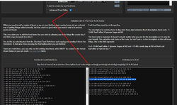
Also if you move beyond the simple getting started bit, you can specify food in quite great detail, for example
Day-Eat at hours-Eat at minutes-Description-food code-fat(g)-carbs(g)-protein(g)-alcohol(g)-weight(g)-GI-Is A Liquid
1-12-00-Bread Wholemeal-gf1-3-37-12-0-100-50-N

582202

So if you diet consists entirely of a home-made smoothie of kelp, lemon and vodka you can specify it
1-08-00-Smoothie-gf1-1-3-22-25-100-45-N
1-12-00-Large Smoothie-gf1-2-6-44-50-150-45-N
1-17-00-Very Large Smoothie-gf1-4-12-44-100-250-45-N

Once you start wanting to type, copy and paste onscreen keyboards become slow and annoying.

I am of the view that if I can explain successfully why a small screen is simply the wrong tool for the job then it is up to the user to agree or disagree. I would rather do this than try to create screens that have so much removed that the purpose gets lost. :-)

Bye

Ian
 
Top Bottom